Apps World 2013 – Design & UX Panel – App design to satisfy app stores and consumers alike
I was invited to speak on a panel at Apps World this year accompanied by James Griffin, Head of Mobile User Experience, BAE Systems Detica, Paul Cooper, Head of App Development, Imagine Publishing and Kathryn Leach, Senior User Experience Designer, BBC. It was moderated by Martin Bryant the Editor-in-Chief at The Next Web.
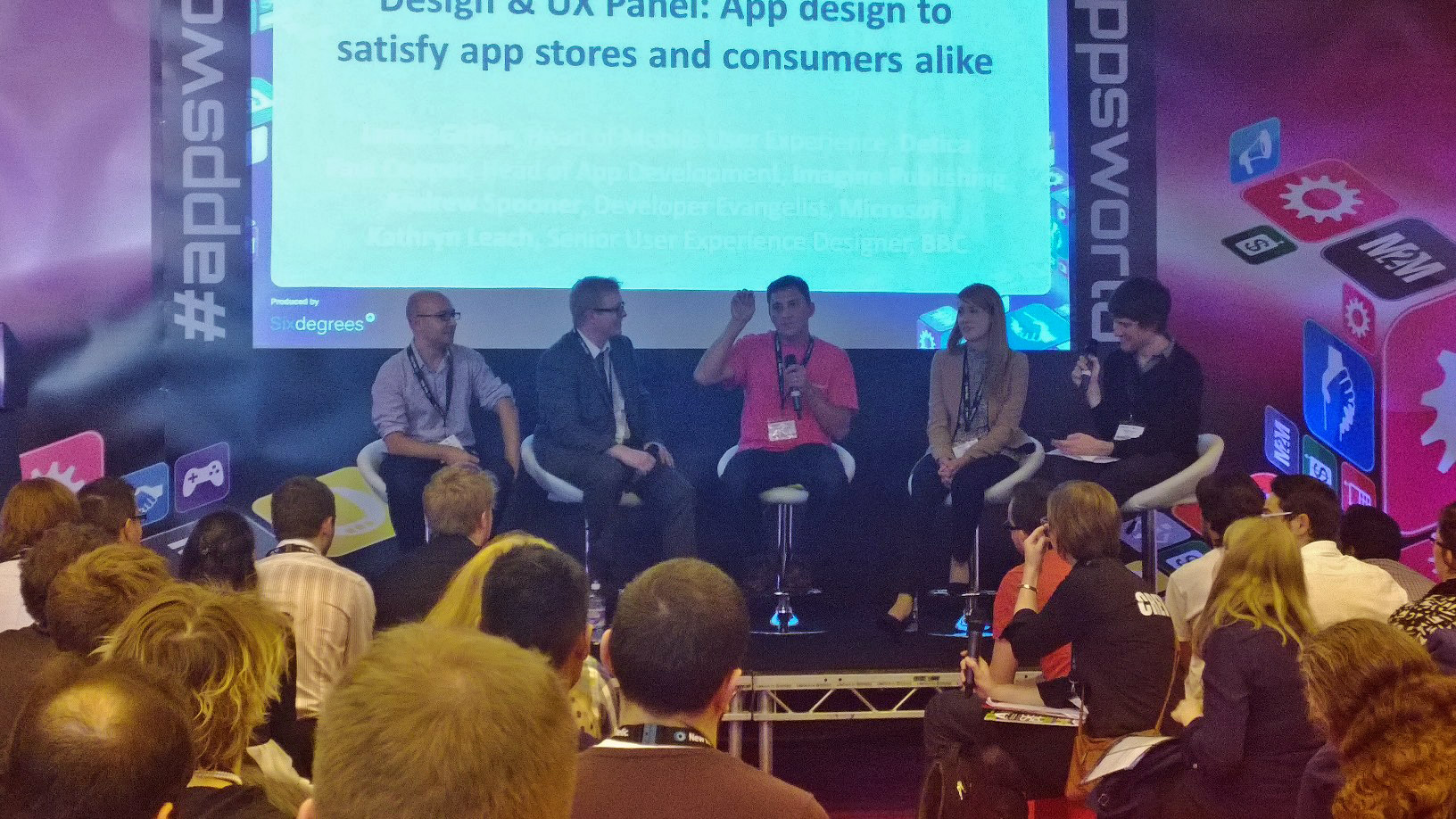
The title of the panel was: Design & UX Panel: App design to satisfy app stores and consumers alike. This was interesting as Kathryn had just left the same stage having talked through how the BBC had approached the design of some of their mobile apps so the topic was very front of mind for the audience. Here’s some of the questions that Martyn asked and my responses.
What ‘box ticking’ elements should your app design contain to keep the app store happy?
Mostly, it is the user that you should be satisfying, users must feel like the application is part of the platform. That’s what makes a user trust a certain app – that they feel they know it already because it inherits much of the behaviour that the operating system it sits on has taught them. Saying that, if you want to please the store owners then you need to think like they do. They want applications that shine on their platform, that take advantage of the unique controls and user features of the operating system and that they would want to promote as great examples of applications on their own platforms. Embrace the UI and UX principles that each platform owner wants to highlight and you will make the store owner’s happy. This is particularly important on the Windows platform where we have a very clear design language and user experience so if you were to copy your application design from another platform, it would feel very much out of place. You really need to design with the platform in mind.
Establishing priorities – designing for the platform vs. a unified user experience across multiple platforms
The best way of making your app fit on a platform is to use the controls that are native to that platform. One of the first steps I take in my UX process once the content has been identified is to think about how I’m going to place that content onto the application’s canvas. I look to use the built-in controls first and identify early on where I will need to create a custom control. A custom control is going to require more effort to build and test and will likely require me to educate the user as to how it works. This can then work to your advantage as it can be the sort of defining usability feature that you can use across your app platforms that makes not only your unique content shine, but highlights your unique (and hopefully) delightful user experience without breaking the conventions of the platform. Remember that outside of design and development teams, the conversation rarely turns to ‘that’s not how it works on my other device’. Users are married to their devices and rarely use the same application across devices so are unlikely to start complaining that an application works a different way on different platforms. They’re much more likely to complain if an application works in a different way to other apps on their device.
Responsive design – best use within app development, and can an evolving design help retain or alienate users?
Firstly, responsive design is difficult. It means that you’re having to think about the flow of the content in a variety of contexts across a variety of screen resolutions. But then, that’s what responsive design is aiming to solve – making the same content display with the same UI across a variety of devices. We’ve been building responsive websites for over 10 years, we used to call it ‘fluid layout’ but what’s changed is that we’re getting better at not just making the layout fluid, but making the content more appropriate for the size of the screen that you’re viewing it on. Far from being a fad, responsive design is something that we actively embrace on Windows. If you’re writing your Windows 8 apps in HTML then we use CSS Media Queries to display the content according to the size of the window that the user wishes it to be displayed in – we apply the same theory if you’re using XAML for your presentation language, the fundamental thinking should be ‘how could I best display this content within the confines of these pixel dimensions’. Of course, you need to be wary that you don’t vary the display of information too much – if the screen redraws with completely different content then you can risk confusing the user. The same is true if a user was to look at content on different devices. If you radically change the way that content is displayed on a 8” tablet and on a 30” all-in-one then you risk confusing the user so you need to make sure that there is still a great level of consistency there.
Unique challenges and opportunities of designing for touch
I think we’re at a stage now where developer and consumers ‘get it’. They know how to touch content in order to directly manipulate it. I look at the way my kids touch screens and their expectation that all screens can be touched in order to interact. Where we will face challenges going forward I believe is where we are using touch inappropriately. Our fingers are a very imprecise input method and sometimes we need to be pixel perfect which requires a mouse or a pen. We are seeing more and more instances where voice is being used as the input device and as users are becoming more comfortable with talking to the machines, we will see this surge in popularity especially as the voice recognition technology is so great these days. I don’t think that mouse will ever be replaced my touch – in the same way that people rubbished the mouse when it was introduced saying ‘why would I want that when I have my lovely command prompt’. Going back to those same doubters after they’d been using a mouse for 6 months and you would likely have a fight on your hands if you tried to take it away. The challenge will be for experience designers to recognise when is appropriate for touch, mouse or pen input. Voice and gesture are going to more common in comoing months so we will need to think about how we integrate those too.
Thanks to Martin for his moderating skills, Paul, James and Kathryn for their own insight and to Paul Lo for the glorious pink Surface tee that I was wearing that day.