Content before Chrome and on-demand UI
‘Take advantage of the screen real estate’. That’s a common saying that was bandied around when working on the web in the early days. As screen resolutions increased we (collective we – designers, developers – the makers of the internet) chose not to celebrate that space and allow the content to breathe, instead we looked to see what we could add that would give us extra ‘stuff’ and more buttons and separator lines and tiled backgrounds even animated GIFs and information and screens became busier, busier, busier. “Look, we have a 100×100 pixel space. Add a button to do something, drop a weather widget in. Fill the space!”. It was a cacophony of visual noise and at the time, we thought it was great. I was there.
That mentality of filling space with confusion I partly blame on science fiction. I’ve often said in public that technologists look to science fiction for inspiration. Who wouldn’t want to have all the buttons and flashing lights that Uhura had in the original Star Trek? Those sets were designed to look complicated – after all, this being the future would surely mean that we would have invented many new technologies and devices and each of those would require at least one button, one light and an accompanying beep. That’s what made those visions of the future so exciting – the level of complexity and the thought that we’d need to be super clever and aware in order to operate these gigantic space engines. Did anyone think that we might also make sweeping advances in UI design so that it could all actually be controlled by a joystick with one button? Maybe, but I doubt that version of Star Trek would have been given the funding from the TV studios, this looks much more exciting:

When I look at games like World of Warcraft, the menus and the stats that you see are bonkers. The first time I played that game it was confusing, more then confusing, it was incomprehensible. Check this:
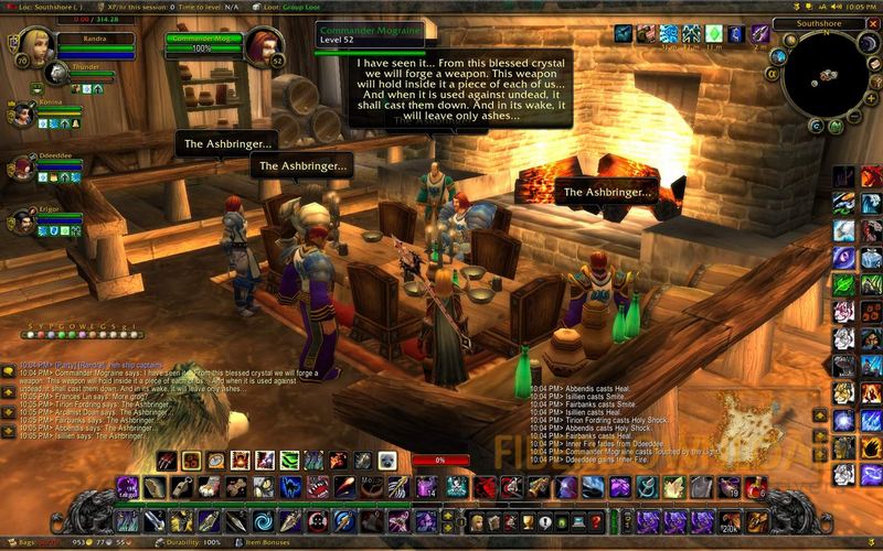
When I started playing, I wondered how I could ever be able to understand what any of that meant. But after a short amount of time, with a little investment, it became second nature and although there are options to turn parts of that UI off, I didn’t. It would have meant that my game play would be slower and I wouldn’t be as quick to respond. Part of being a player, a good player, was being able to read that interface. If this WoW talk is all gobbledygook to you then at least take a moment to enjoy Leroy Jenkins, one of my favourite examples of video that justifies the whole of the internet (WARNING: colourful language alert):
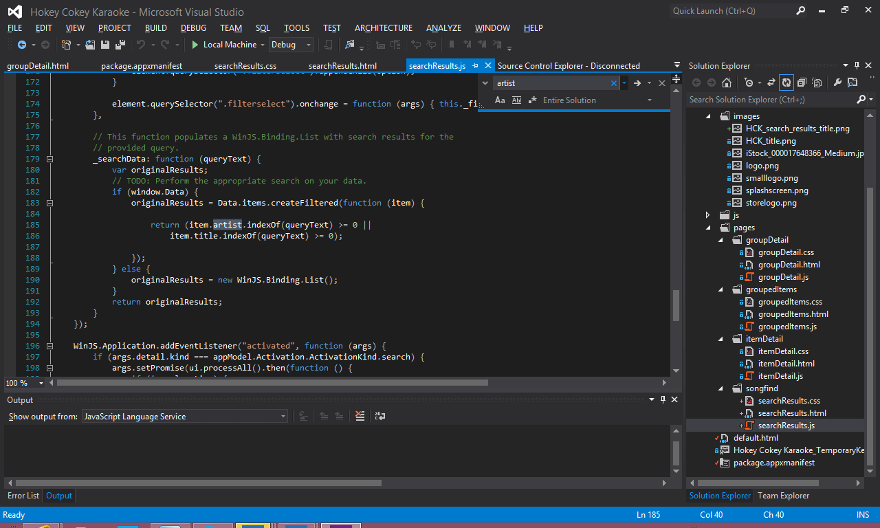
We have complicated UI on desktop programs – but they need to be complicated because they’re doing complicated things. For instance, Visual Studio – there’s even more detail required there than in WoW and complicated applications like that are not going to go away, here’s my current Visual Studio screen:
With Windows 8 we now have a new style of application – Windows Store applications. These applications seek to remove as much of the UI from the screen as possible – the concept behind this being that if there’s no UI on the screen then the user’s focus is on the content. Here’s a screenshot of a photo of mine in the Photo application:
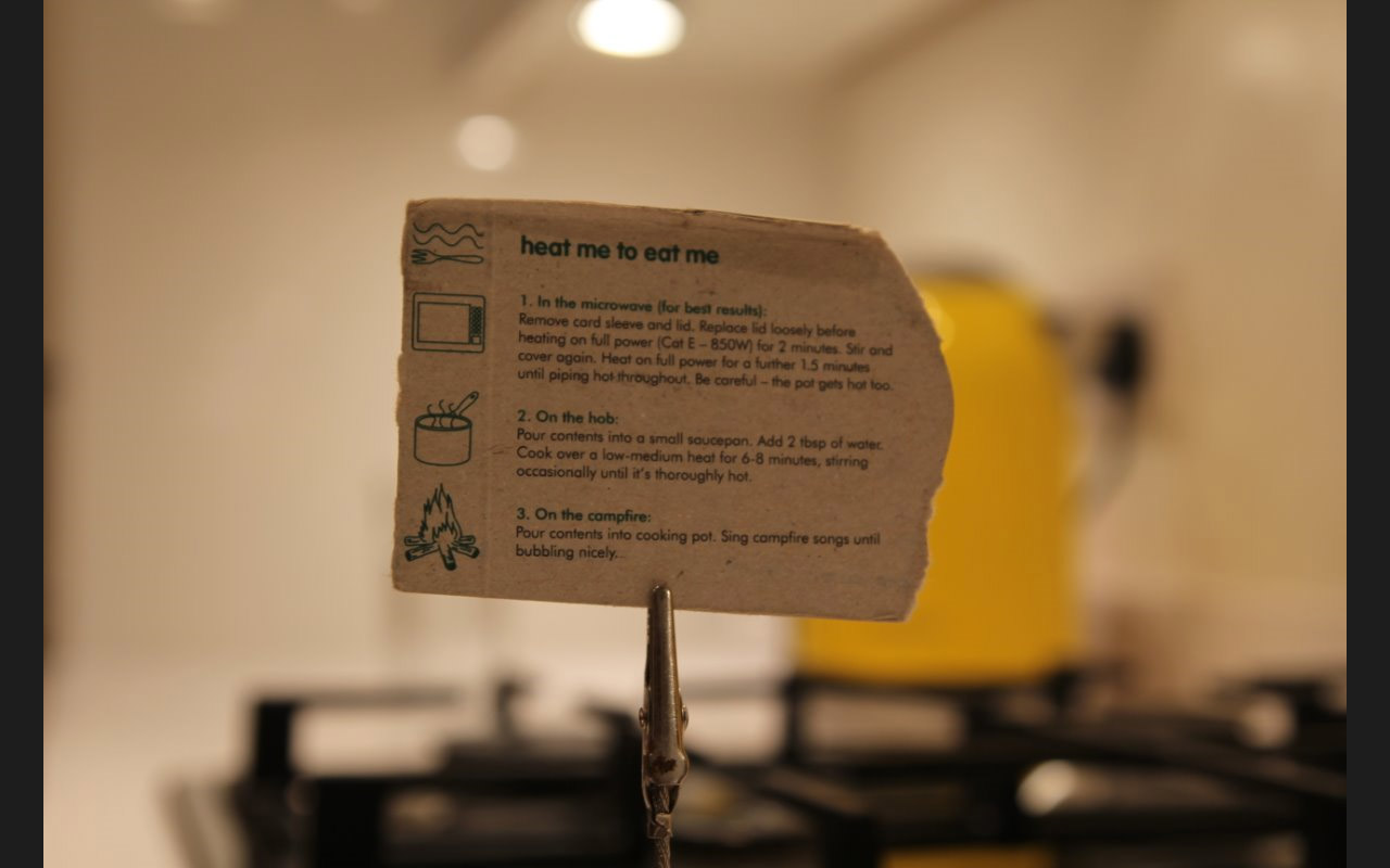
There’s no UI on the screen – there doesn’t need to be and it means that the content gets my full visual focus. The content then becomes the UI, the inherent nature of that particular piece of content within the context of that application means I know if I touch and swipe I can then cycle through the other photos on my machine. We don’t need a button to indicate that that is the method of interaction, we’ve removed the chrome. However, if wanted to do something more than swipe through my photos, our approach is to employ on-demand UI.
On-demand UI
With Windows 8, if the content on the screen isn’t, or can’t be the interaction then we look to the edge. To the right for the Charms Bar for searching, sharing and settings, and if I want to find commands to interact with the screen, I swipe from the top or the bottom to pull up a control that we refer to as the Application Bar. Here’s the same photo after I’ve swiped in from the top:
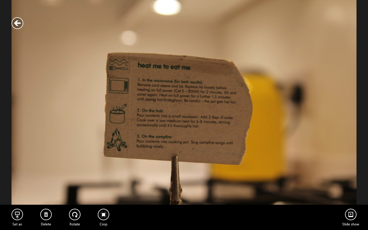
You can see that I now have a back button on the top right (which takes me to a folder view of my images) or on the bottom application bar I can now perform some editing functions but I call on those functions only when I need them.
With the Modern UI, I celebrate the content and embrace the space available in the application. In the photo example above, that application is all about me enjoying my photos and not having to be distracted by buttons around the photos that could distract me from the task at hand. The Photos app is a very visual example, but how about an audible example, with Xbox Music. When I have that open, I’m enjoying the music that I’m listening to, I can glance at the screen and see exactly what track is playing without figuring out the UI first.
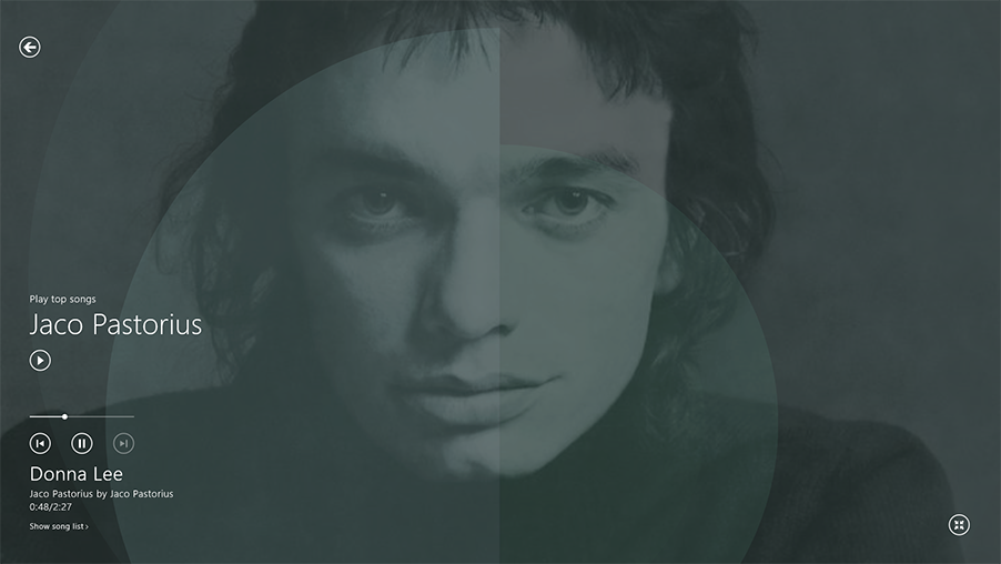
I can see what song is playing, where abouts in that track I am and if i’m not interacting with the app then I enjoy the additional imagery that’s pulled in from the cloud and that augments the experience. It’s like when the radio in my car would not just say ‘Radio 2’ but would say Radio 2, Chris Evans, and even tell me the name of the track. A small bit of information that doesn’t distract from the experience, but adds to the experience.
The same is true of Windows Store apps. That’s the beauty of the Modern UI. It’s all about the content. I don’t need to know the biography of the artist, I don’t need to know who the bass player is but at the time when I do, then by using the edges of the screen I can use the on-demand ui get to that information. That’s the key. 95% of the time it’s just visual noise, but if I need it I can get it.
Reduce distractions
If I’m reading a book, all I want to see is the words that the writer has written. I like the Kindle for this, there’s not even a clock on it – I’m sure there was a conscious decision made by the designers at Amazon at some point when it would have been so easy to incorporate a clock into the top corner of the screen. Maybe that’s their homage to the authenticity of a book. Maybe, they recognised that when you’re reading it’s about the story. It’s a feature that I find both annoying but also amazingly satisfying about reading on my Kindle. Any additional info that’s placed on the screen is only a distraction. ‘How long have I been reading?’ ‘How long do I have before I should go to bed?’ That’s why I love my Kindle, because it makes me just read and read and not care about the time and I’ll read till the early hours of the morning because the story is brilliant and there’s not a clock to remind me that it’s only 5 hours till daybreak. I don’t care. I want to know how Ender will finish his game.
Ho Designers
The same is true of Windows Store applications. When you decide what it is that your app is meant to be doing, don’t worry about the extra space that is available that you could fill with info, let the the user enjoy the content of the app, let the user revel in the content that you’ve worked so hard on and when they need to interact with your content, they know to look to the edge to find that interaction. Celebrate space.
This can be a difficult concept to grasp, especially when you’re coming from a different platform, be that a traditional Windows desktop applications or an application on another platform. But once you get it, you realise that it allows your user to enjoy and immerse themselves in the product they’re investigating, the article they’re reading, the image they’re viewing.
I spent some time with a chap at one of our workshops who had the most incredibly complicated desktop application. He had been tasked by his boss to turn it into a touch screen app. After reviewing the functionality, it was clear that this was never going to happen, however, when we talked through how his desktop app was used, it became clear that 10% of the time it required the complicated desktop application experience, 90% of the time it could be a touch screen app. So his desktop app did not and never will disappear, but it became apparent that there could be a touch app used 90% of the time to keep the day to day running of the app in place. That made me really happy. For 2 reasons.
- Desktop apps will never disappear – some apps will always have a level of complexity that cannot be translated to a touch screen be that because of the complexity of the app itself or maybe the requirement for precise input of a lot of data (our fingers are not very precise when matched aginst a mouse) eg, Visual Studio, Visio or Photoshop
- There are aspects of these programs that can become touch enabled and separated out to this new style of application, and as such become more accessible to a wider audience on a number of different devices
The lesson we learn there is – user context – recognise when your app is going to be used and customise for those user scenarios. Don’t try and convert an app to a tablet because that’s what you carry around in your pocket. Customise for touch, where touch is appropriate.
Celebrate the content
Allow the user to immerse themselves and only when they need to interact should they have to bring up the commands that allow them to do so. The application bar is your friend. For Windows 8 users it quickly becomes second nature. You digest the content on the screen and at the point where you need to change it, share it, move it, interact with it, you look to that first pixel and the on-demand UI gracefully glides in.
We are creatures of habit and we don’t like change. However, we are also brilliant at recognising and adapting to more efficient and beautiful ways of working.
Find out more: http://design.windows.com/.