Tip o’ the hat to the Modern UI
The new Windows 8 interface commonly referenced to as the Windows Modern UI is inspired by various trends and design patterns from over the last century. Modern UI tips it’s own hat to the way finding graphics that you see in airports and train stations, that style in turn tips it’s hat to the strong design principles of classic Swiss graphic design with it’s bold colours and strong typographic layout that emphasise cleanliness, readability and objectivity which is just what you need in signage in transportation centres (I made a film about it ‘Navigation with way finding graphics‘ last year).
There’s a saying going around that ‘everything is a remix’ and that’s a thought that I’ve spoken about publically on a few occasions saying that ‘there is no such thing as a new idea, just fusions of current technologies’ and the same can be said of design trends. Where taking two current styles and combining them with new eyes can create something new. With Modern UI, I feel it’s a remix of both, where a visual aesthetic was taken to answer the challenge laid on by new technology – that of the small touch screen.
Modern UI would have been unlikely to come about without the challenge of having to create an interface for small touch devices and so itself is a remix of classic design and digital form factor.
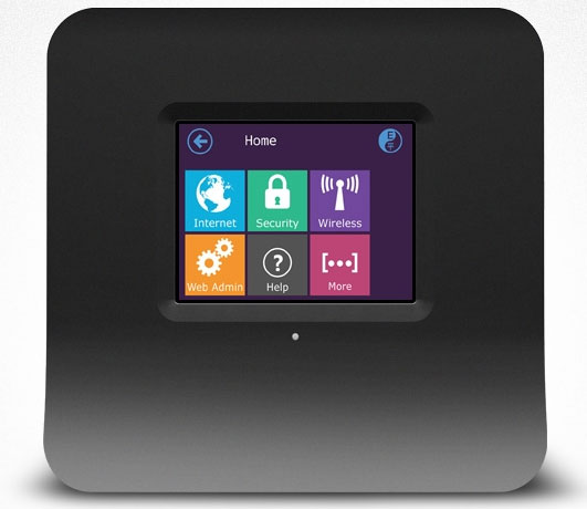
Last week however I saw an article about the Securifi Almond, a touch-screen router which more than tips it’s hat to the Modern UI, so much so that initially I thought it was running an embedded version of Windows 8. Maybe they arrived to the same solution as they had the same challenges but I doubt it. Imitation is the sincerest form of flattery?