Monochromatic Icon resources for Windows Apps & the Modern UI
 Creating great icons for apps and web projects is hard. It is a skill that many people take forward to a full time occupation as it not only requires great thought and inspiration, research and dedication but also technical and creative skill.
For me, the best icons are those which (where appropriate and necessary) are able to evoke emotion whilst remaining true to the brand, style or essence of the idea or project that they represent. That’s easy to put in words, but massively difficult to execute. Oh, and I need them to be yellow.
So, you’re faced with a couple of options. Spend your hard saved £’s on engaging with a designer who has made iconography their living, or, seek out publically available resources which will save you time (and face) and money. But don’t worry, these days, being cheap doesn’t mean looking crass.
There was a time when I’d put my effort into creating my own icons but of late, I’ve turned to online resources that will take the pain and effort out of having to create your own or, dramatically reduce the cost of hiring someone to create them for you.
In no particular order of quality or functionality…
The Noun Project
Free if you attribute the icons or (as I would advise) pay a minimal fee to use without attribution – they also now offer a subscription service that gives you a discount without attribution. Great search functionality and there’s always something the crops up which makes me think ‘that’s not what I was looking for’ but it says what I was trying to say and I know when I pay for an icon that I’m supporting the person who spent the time creating it. Files are delivered in SVG or XAML format.
Look for yourself: http://thenounproject.com/
IcoMoon
Allows you to search a free catalogue of icons and then download them. However, my fav feature from this service allows you to bundle the icons you want to use into a font that they will then host so you can call these into your web project via CSS and your users only take on the bandwidth hit for what they need to view. You can also update your fonts on the fly which means you don’t have to update your project. Touch.
You can download as SVG files or as a font that you can then embed in your project.
Check it out at http://icomoon.io/
Segoe UI Symbols
It’s a trick that we’ve used on the web for years. I used to use it in my Flash apps going back over 10 years when I was first faced with the problem of how to consistently and easily use a client’s logo in a Flash movie – I’d convert it to a font and embed it in the SWF. The advantage in doing this is that each time you call that ‘character’ it would be rendered as a vector graphic by the rendering engine and so preserve the quality of the image regardless of the size it was displayed at. We can do the same in Windows apps today. Using any of the symbols in the Segoe UI Symbols font means that they will display beautifully on all screens at all resolutions and means that you don’t have to worry about rasterising bitmap images at different sizes for different resolutions. These are the icons that are used in Windows for almost all of the system UI icons so if you can take advantage of them you’re saving yourself the time in both sourcing your own and also in educating your users as to their meaning.
Check this post for full UI Guidelines for Segoe UI Symbol icons
Other Monochromatic Icon Resources
Here’s a list of links to sites I’ve not used but you may find useful if you can’t find something you need using the 3 options above.
- http://modernuiicons.com/
- http://www.thexamlproject.com/
- http://hlvticons.ch/
- http://glyphicons.com/
- http://iconify.info/monochrome/
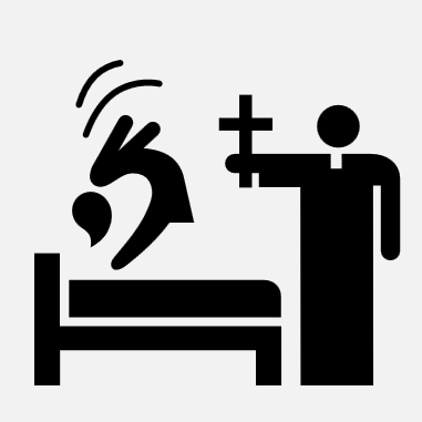
The Exorcism icon used in this post was purchased from The Noun Project and designed by Luis Prado.