Digital Patina – showing signs of wear / use on a digital interface
Following on from my previous post on digital patina, I wondered if there’s another way to look at this. This isn’t something I’ve seen, I’m not sure if I want to see it and it could go against the very foundation of all things digital but, it did conjure up an idea in the back of my head that I couldn’t shake off.
Question…
Could a digital UI age over time? And if it did, what could I (as the user) learn from it?
The following is posed mostly as a series of questions. I don’t have the answers and I’m not in a situation where I can test this with any of my own apps – they just don’t have the usage that would make this reasonable to test so I’m just putting it out there…
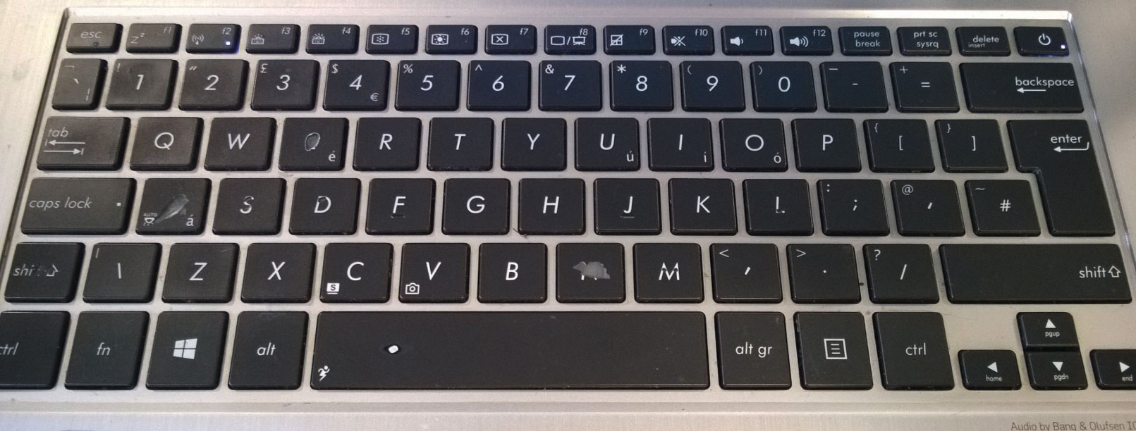
I started this thought with a tweet I saw a few months back. Someone posted a picture of their worn keyboard – the patina on certain keys suggested that it needed replacing – we’ve all seen it. Look at yours now. Unless it’s very new, I’m sure it shows some of the same signs, even your phone, the exterior buttons, the volume rocker, they probably show some signs of use too. That got me thinking, can a virtual keyboard do the same? Can parts of a UI that are used a lot show signs of use over time? Can the button that you’ve never used have a visual state that tells you ‘YOU’VE NEVER USED ME!’.
What if a digital button had a limited use?
Maybe a button has 10,000 touches and over time, with each touch the opacity of that button decreases by 1/10,000th? It would show a few things. We use analytics to tell us how people use applications and the pages that they visit. The ‘owners’ of those applications use those analytics to optimise their apps/websites. But why should we not share those analytics and that insight with users on a personal level?
I’d be interested in knowing how I use certain applications and seeing visually the wear & tear on a digital interface of applications I use most often. We use machine learning to create better and more personal experiences for a user – show them more similar articles to the ones they seem to read most often, suggest products that align with their product purchase history, but what if an application can tell me what I don’t know? The news app on my phone would probably tell me that I don’t read (and therefore probably don’t know) anything about politics outside of the UK or USA. And whilst I’m not really interested (sorry, I’m just busy reading other things), there’s local implications to me of those global political decisions that I should probably be aware of.
Put that in context of a digital application. Which buttons don’t show signs of wear? What buttons am I not pressing? Why am I not using those buttons? Why did the developer put them there? Or at a glance to make me think…
…what am I missing?
Without looking at the telemetry (which I can’t look at anyway) I’m guessing that my most used applications are Visual Studio, PowerPoint & OneNote (where I’m writing this right now). I look at the ribbon in OneNote and realise that I’ve never clicked or touched on the History or Review menus. I never knew that I could view edits by date or by author (I have a lot of shared notebooks) or that I had spell check, thesaurus or translate in the review menu. I see that now and will look to use them more often going forward. But if the UI itself can bring to my attention the functionality that I’m not using, then that’s as good as (or better than?) teaching me how to use an application, like really subtle visual hints highly personalised to me.
Visually impose that on a UI?
Can a piece of UI that’s not been used over time begin to shine brighter, or does everything else start to fade – that’s another way I suppose of looking at the same problem I guess.
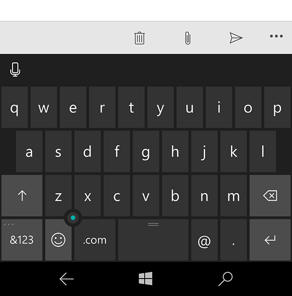
Maybe a digital keyboard would start to look like this animated GIF:
So, where do you want to go from here..?
IF…that’s a route that an app developer decides to go down, then how does the user refresh the interface so that it can be properly seen and used again in the same way I can replace a physical keyboard? Maybe through an in-app purchase? Does that then replace the whole UI or just those worn out buttons? I suppose this would depend on the context of the application and the user and the business model of the app. It would also introduce an additional level of complexity for designers (and do we really need that?) and possibly confusion to the user. Does the UI get refreshed with an operating system or app update? Does it require me to move to a new device? Do I want that level of digital patina to follow me to a new device or persist to each place that I touch an application?
Again, I think that depends on the app’s use but (secretly) it’s an area that I’d like to see someone explore.
As I said, more a series of questions about what’s possible, not what’s right or wrong or what I’d even maybe want to see / use myself, just some thoughts…
In the comments or on Twitter @andspo please…